Writing /
Everything I Know About Style Guides, Component Libraries, and Design Systems
Introduction
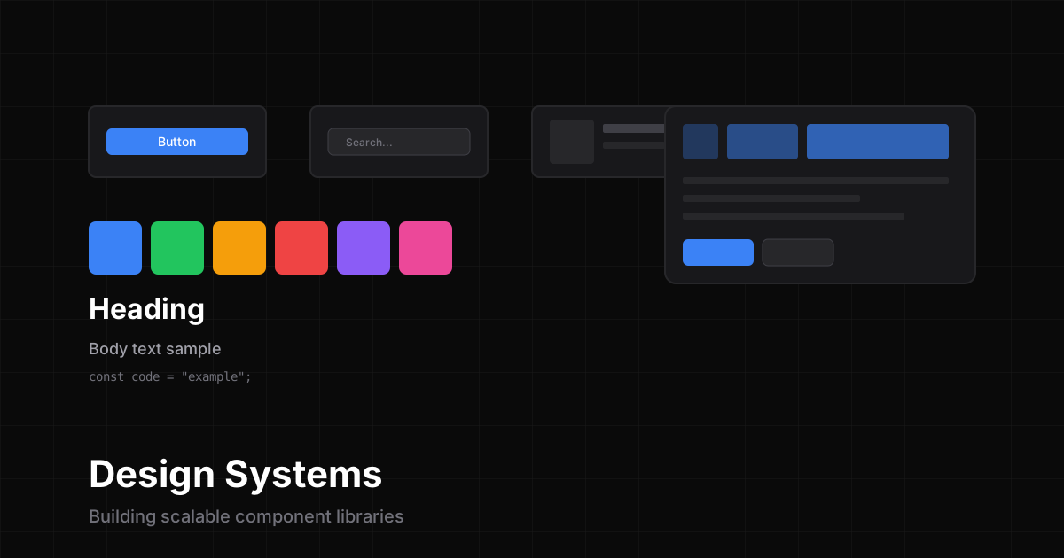
After years of building web applications and working with various teams, I’ve learned that a well-designed style guide and component library can make or break a project. In this post, I’ll share everything I know about creating scalable design systems.
What’s the Difference?
Let’s start by clarifying the terminology:
Style Guide
A style guide is a set of standards for writing and designing content. It includes:
- Typography rules (fonts, sizes, line heights)
- Color palettes
- Spacing systems
- Brand guidelines
Component Library
A component library is a collection of reusable UI components:
// Example Button component
interface ButtonProps {
  variant: 'primary' | 'secondary' | 'ghost';
  size: 'sm' | 'md' | 'lg';
  children: React.ReactNode;
}

export function Button({ variant, size, children }: ButtonProps) {
  return (
    <button className={`btn btn-${variant} btn-${size}`}>
      {children}
    </button>
  );
}
Design System
A design system combines both—it’s the complete set of standards, documentation, and components that define how a product looks and feels.
Building Blocks of a Design System
1. Design Tokens
Design tokens are the atomic values of your design system:
:root {
  /* Colors */
  --color-primary: #3b82f6;
  --color-secondary: #64748b;
  --color-success: #22c55e;
  --color-error: #ef4444;

  /* Spacing */
  --space-1: 0.25rem;
  --space-2: 0.5rem;
  --space-4: 1rem;
  --space-8: 2rem;

  /* Typography */
  --font-sans: 'Inter', sans-serif;
  --font-mono: 'JetBrains Mono', monospace;
}
2. Component Architecture
Structure your components with these patterns:
- Primitive Components - Basic building blocks (Button, Input, Text)
- Composite Components - Combinations of primitives (SearchBar, Card)
- Pattern Components - Complex, reusable patterns (DataTable, Modal)
3. Documentation
Good documentation includes:
- Usage examples - Show how to use each component
- Props API - Document all component props
- Accessibility - A11y guidelines and requirements
- Do’s and Don’ts - Visual examples of correct/incorrect usage
Tools I Recommend
Here are my favorite tools for building design systems:
| Tool | Purpose |
|---|---|
| Figma | Design and prototyping |
| Storybook | Component documentation |
| Tailwind CSS | Utility-first styling |
| Radix UI | Accessible primitives |
| CVA | Class variance authority |
Best Practices
1. Start Small
Don’t try to build everything at once. Start with:
- A color system
- Typography scale
- 3-5 core components
2. Document As You Go
Write documentation alongside development, not after:
## Button

The Button component is used for user actions.

### Usage

\`\`\`tsx
<Button variant="primary">Click me</Button>
\`\`\`

### Props

| Prop | Type | Default | Description |
|------|------|---------|-------------|
| variant | string | 'primary' | Button style variant |
| size | string | 'md' | Button size |
3. Version Your System
Use semantic versioning:
- Major - Breaking changes
- Minor - New features
- Patch - Bug fixes
4. Automate Everything
Set up automation for:
- Visual regression testing
- Accessibility audits
- Bundle size monitoring
- Changelog generation
Conclusion
Building a design system is a journey, not a destination. Start small, iterate often, and always keep your users (both designers and developers) in mind.
The best design system is one that people actually want to use.